3 Pitfalls to Avoid in Data Visualization
 |
By Shyam Nair
Competitive Intelligence Analyst
|
|
While there are several opinions extolling the virtues of data visualization, it is equally important to acknowledge the risks before taking the plunge. Here are a few checkpoints:
Lesson #1: Start with the data, not the visual. Be honest.
“Torture the data, and it will confess to anything”
- Ronald Coase, Nobel Prize Laureate (Econ.)
Put simply, there is no substitute for rich content. One should conduct a few key sanity checks before visualization to make sure:
- The underlying data is relevant to the assertion being made
- The data is exhaustive and sufficient to provide an accurate perspective, and
- The data is cleansed to identify and validate outliers (if any).
One of the common errors in judgment is to commit to a certain graphic and force-fit the data to make it look compelling, a.k.a. researcher’s bias. While a visual does draw the reader’s attention, it is fruitless with even an iota of lingering suspicion about the data’s integrity. Therefore, it is important to provide references and context to your visualization.
Lesson #2: Do not visualize for visualization’s sake. Keep it simple.
“If you can’t explain it simply, you don’t understand it well enough”
- Albert Einstein
Visualization should be perceived as an instrument enriching your narrative, not as the somewhat annoying advertisements that keep appearing at regular intervals in your favorite TV series. If your audience is comfortable with a simple pie chart, do not overwhelm with a tree map unless you want to force them to notice a shift in the hierarchical order they never expected to see.
Here’s another scenario – Think about how the visual would look if the reader was color blind. And believe me, that is a very distinct possibility. According to Wikipedia, about 8 percent of males and about 0.5 percent of females are color blind, in some way or another. The best way to work around this limitation is to use colors sparingly, and when essential, stick to varying shades of a single color.
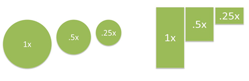
Similarly, research shows that while people are good at estimating lengths, they are not as good with volumes. For instance, imagine the charts below without their labels. While the chart on the left is accurate to scale, the chances of misinterpretation are considerably higher than the chart on the right.
Lesson #3: Commit to a visual, not a tool. Experiment.
“Experience is the past tense of experiment.”
― Gegory Alan Elliot
There are many promising visualization tools, such as Visual.ly, iCharts, Google Charts, Tableau, just to name a very few. But one thing is common across the board – all tools have definite boundaries and limitations. Therefore, it is important not to sandbox one’s creativity within any particular tool. Once you have determined the best visual to convey your message, be open to experiment with a handful of tools to pick one that suits your needs in that instance.
The final word – a picture is worth a thousand words, so keep visualizing!
About the Author
Shyam S. Nair is a competitive intelligence practitioner, fortunate to have learned the ropes at leading professional services firms. In his spare time, Shyam likes to read and write about the tradecraft of CI. It should be noted that the views expressed in this article are the author’s own and don’t necessarily represent positions, strategies, or opinions of the author’s current or past employers. If you have any feedback, you may write to
shyam.sreekumar.nair@gmail.com
|
| |
|

No comments:
Post a Comment